Lincoln Orthopedic Physical Therapy
BRAND AWARENESS MARKETING CAMPAIGN
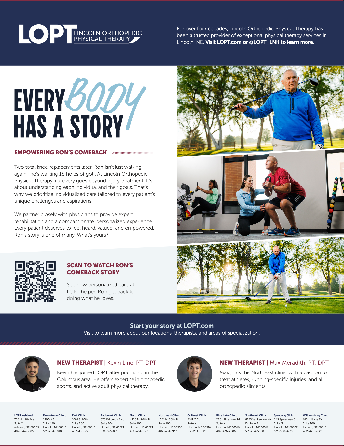
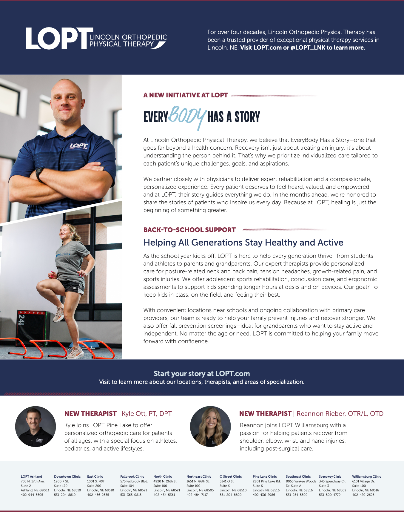
For more than four decades, Lincoln Orthopedic Physical Therapy has been a trusted provider of exceptional care, serving patients through ten facilities in Lincoln and one in Ashland, Nebraska. When LOPT came to UNANIMOUS, they had already developed the EveryBody Has A Story concept and were seeking a brand awareness campaign to bring it to life. I concepted, presented, and built a compelling visual identity around the message and recommended a strategic marketing plan and supporting tactics to amplify its impact. Centered on LOPT’s belief that recovery goes far beyond treating an injury, the campaign highlights the importance of understanding each patient’s unique challenges, goals, and aspirations—ensuring every individual feels heard, valued, and empowered. Since the deployment of the campaign, LOPT has hired 4 new employees, announced the opening of a new location, and have received over 500 new patient calls.
Agency: UNANIMOUS
Graphic Designer, Brand Strategist: Emily Bray
Marketing Director: Jamie Riha
Copy Direction: Avery Smith
Video Director: Makayla Hogenson
Campaign Logo & Visual Treatment
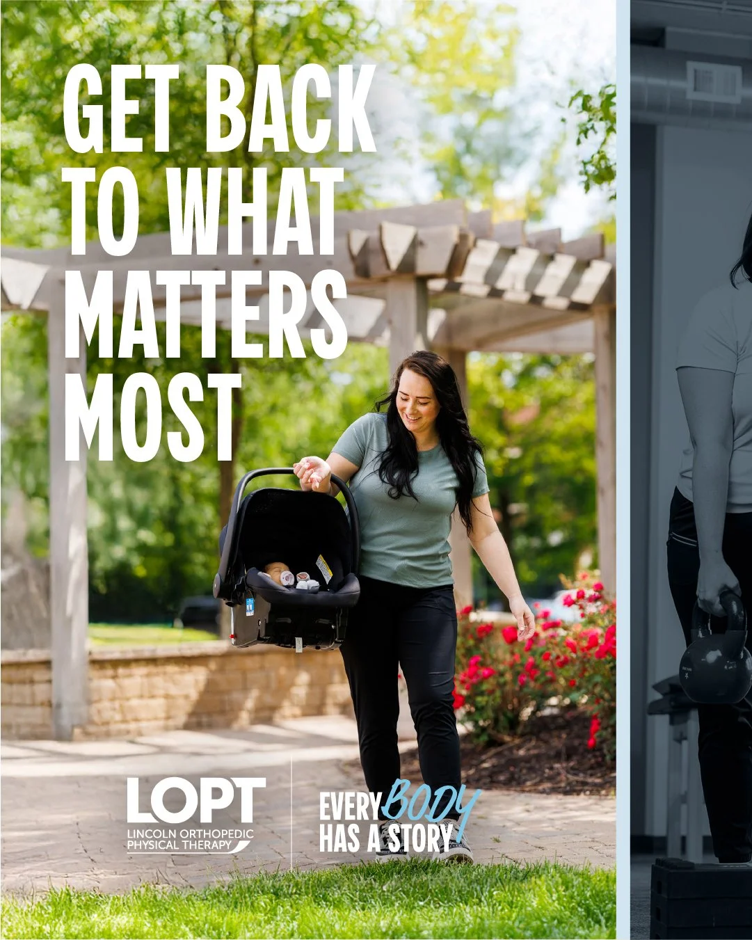
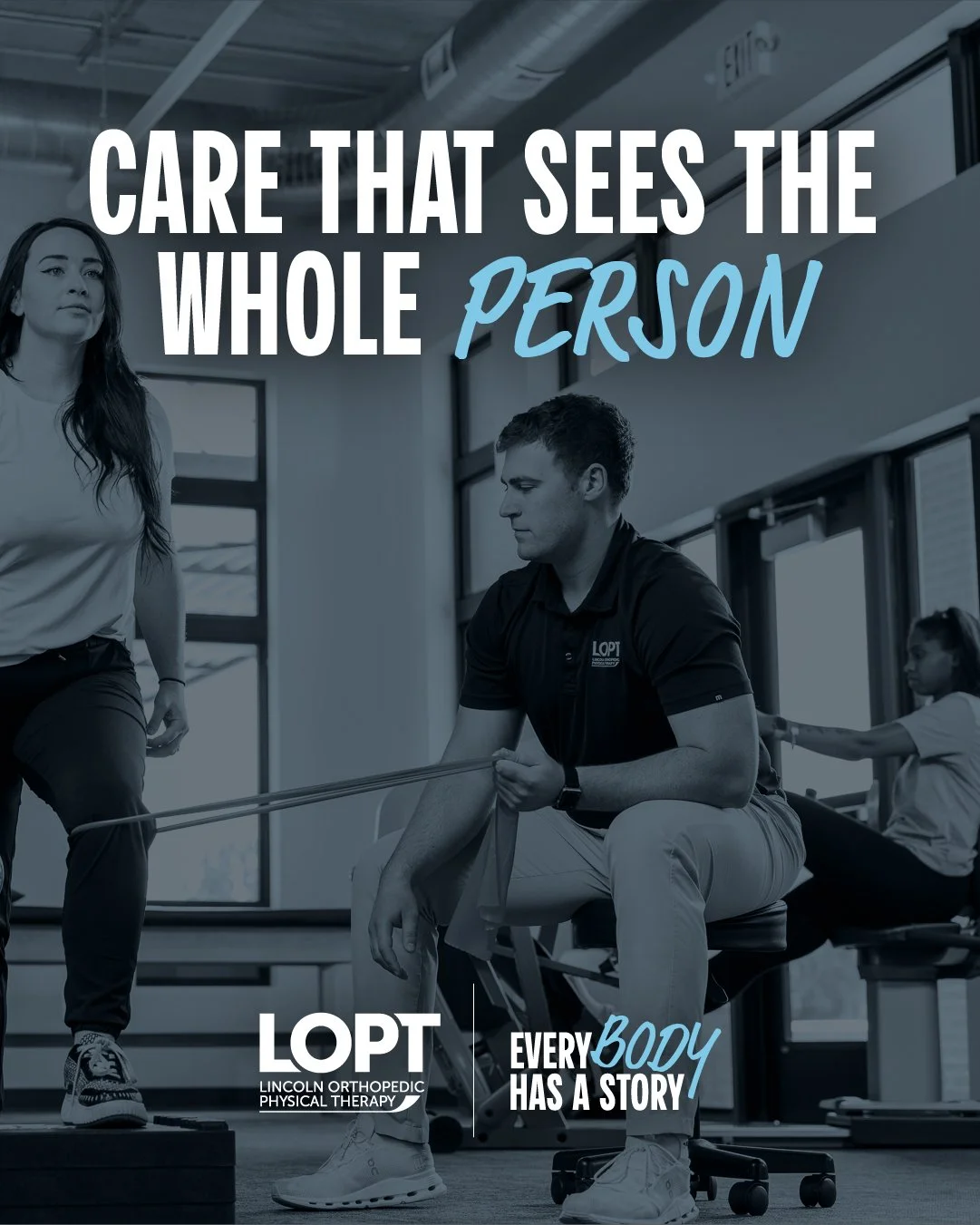
When the final messaging was approved, I developed three distinct visual directions to show how the campaign could come to life. In this concept, the word “BODY” is rendered in a hand-drawn, intentionally imperfect typeface to represent the non-linear nature of healing. No two recovery journeys look the same—and this imperfect typography reflects the beauty in every patient’s unique path.
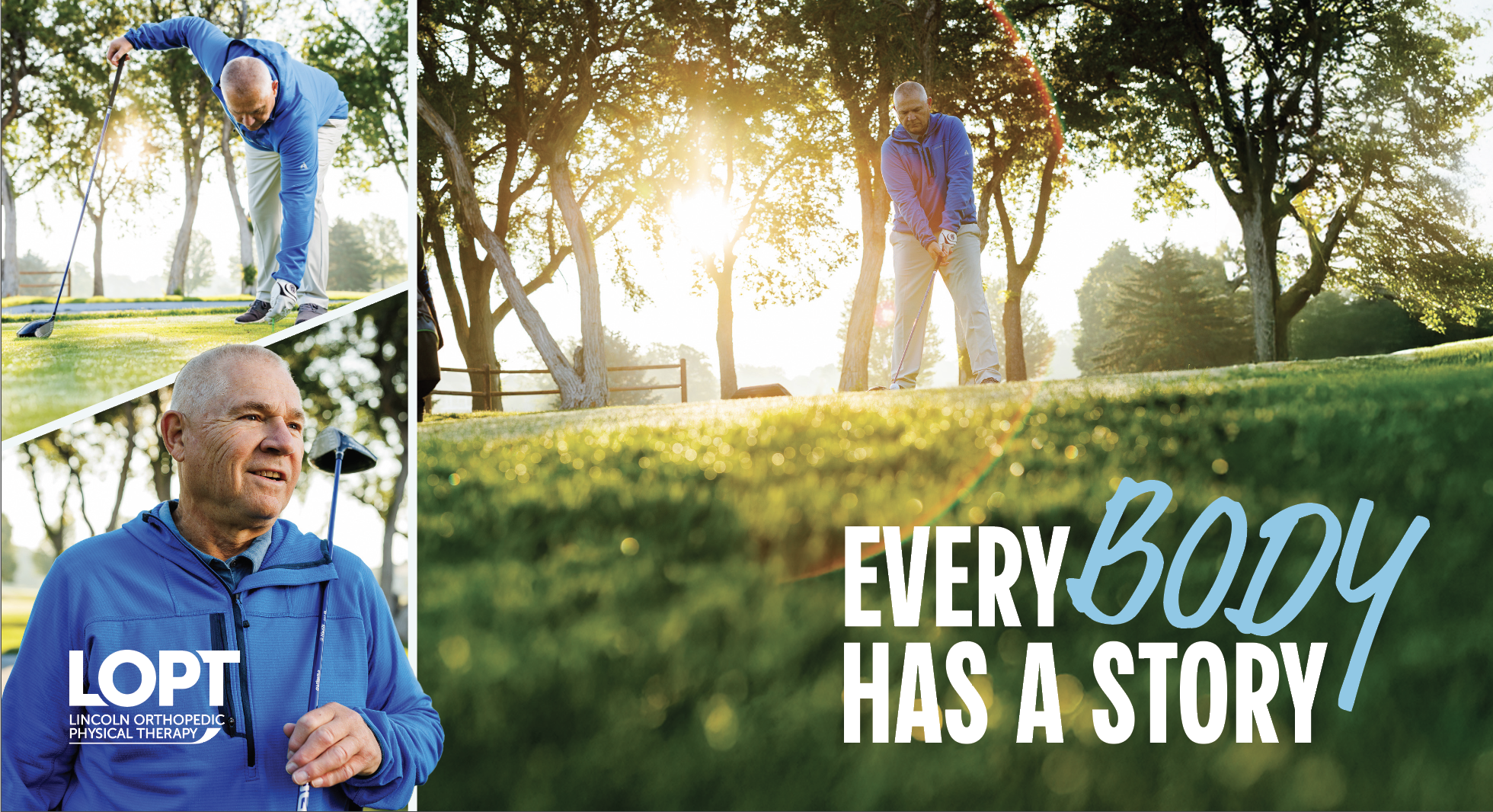
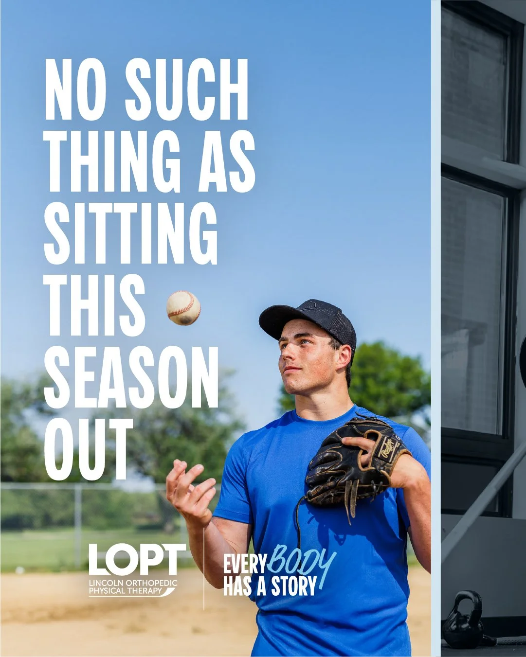
EDDM Postcard | Ron Front of Postcard
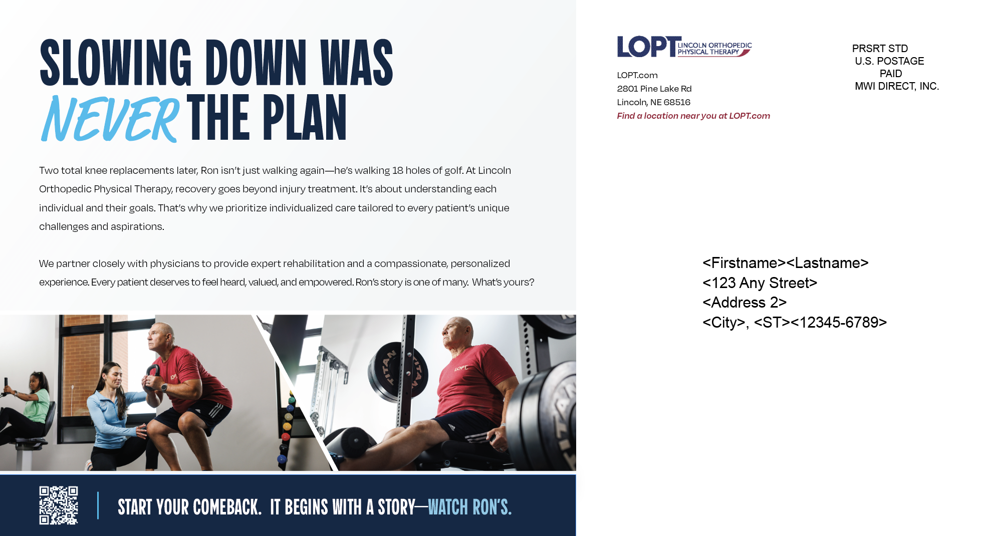
EDDM Postcard | Ron Back of Postcard

EDDM Postcard | CC Front of Postcard

EDDM Postcard | CC Back of Postcard

EDDM Postcard | Mason Front of Postcard

EDDM Postcard | Mason Back of Postcard

EDDM Postcard | Lydia Front of Postcard

EDDM Postcard | Lydia Back of Postcard
Internal Signage | Roll-Up Banners
To support the internal launch of the company’s brand awareness campaign, I designed a set of roll-up pop-up banners that brought the new visual identity into high-traffic workplace environments. These banners translated key campaign messages into bold, cohesive visuals that employees would encounter throughout their daily routines—reinforcing brand alignment, sparking curiosity, and creating a sense of shared excitement around the initiative. By balancing clarity, visual impact, and on-brand storytelling, the signage helped build internal momentum and strengthen employee and patient connection to the campaign’s core mission.


Organic Social Media Carousel Post: Sports Therapy Focused

Organic Social Media Carousel Post: Mobility Focused
Organic Social Media Carousel Post: Sports Therapy Focused


Organic Social Media Carousel Post: Orthopedic Rehab Focused


Half-Page Welcome Folder
Campaign Insert
As part of the campaign’s patient-facing materials, I created a half-page printed insert designed to fit seamlessly into the existing welcome folder. This piece served as a clear, approachable introduction to the brand awareness campaign, highlighting its purpose and reassuring patients of the organization’s commitment to their care. By pairing concise messaging with warm, accessible visuals, the insert offered a quick but meaningful touchpoint—helping patients feel informed, supported, and connected to the campaign from their very first interaction.
Introducing the Campaign into LOPT Collateral: Physician Handouts
To extend the campaign’s reach beyond the clinic and strengthen relationships with referring providers, I designed a concise, visually engaging physician handout for LOPT’s marketing team to distribute during office visits. The flyer distilled the campaign’s key messages into a quick, easy-to-skim format tailored to busy physicians and staff. By combining clear value points with cohesive campaign visuals, the piece not only reinforced brand recognition but also equipped providers with a better understanding of LOPT’s mission—ultimately supporting stronger referral partnerships and more informed patient conversations.